Serving New Looks with a Website Redesign

Serving New Looks with a Website Redesign
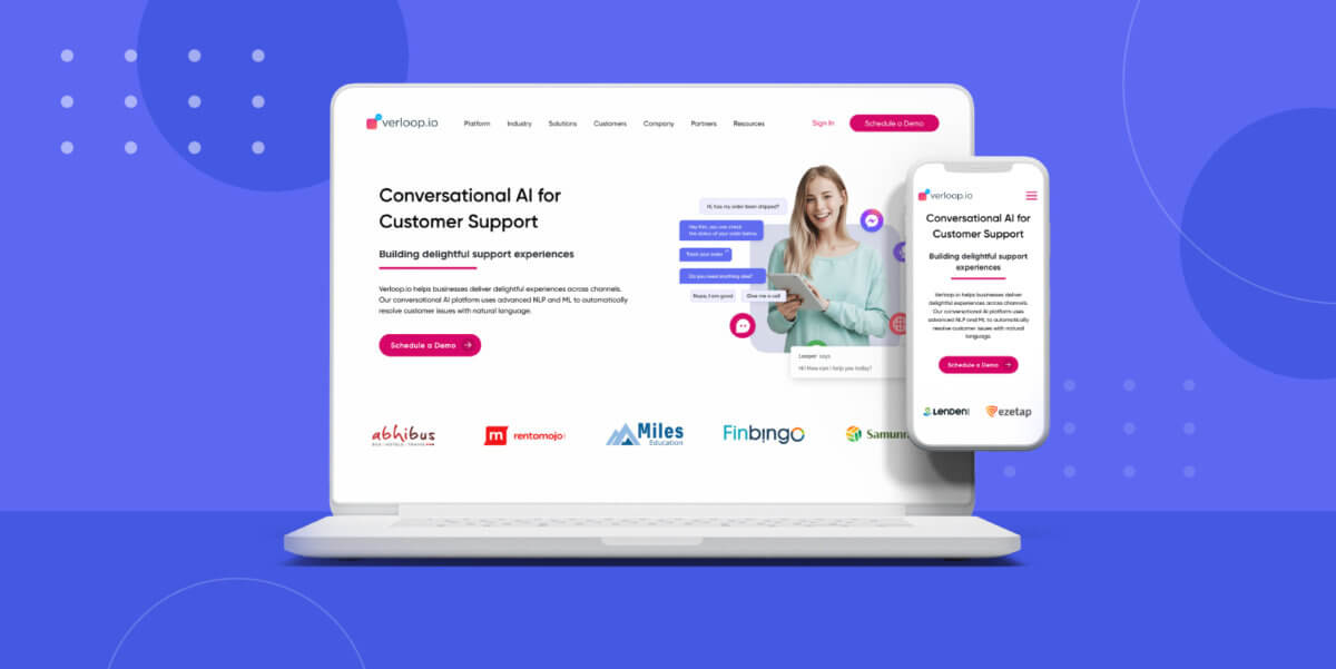
Our website has had a complete redesign. We did this to present information in an easy and straightforward way. It is now our best salesperson.
Website. It’s that one place your clients or prospect visits to know more about your business. Studies show that almost 70% of a buyer’s journey is completed before a prospect contacts or engages with your sales team.
A website is the first interaction a client has with your business.
Since most consumers do research before filling the form on your website, it’s essential to make a great first impression. The website becomes one of the best salespeople on the team. It should be able to communicate with clients and share the right knowledge. In other words, it should convert prospects into leads and clients, just like any other salesperson.
For a company, a website also helps you communicate your positioning. How you talk about your services, products and company represent your business.
Why did we redesign our website?
Our old website was simple, clean and modern. It shared a lot of information about Verloop.io and also generated leads. But it didn’t communicate what our product did and the level at which it worked to solve issues pertaining to the customer support domain.
Moreover, our design language changed over the past year and we wanted to showcase that on our website as well.
While redesigning the website, we kept the above points in mind and approached it with customers in mind. A website where they could easily navigate through to find the information they are looking for.
Communicate the brand mission and vision better
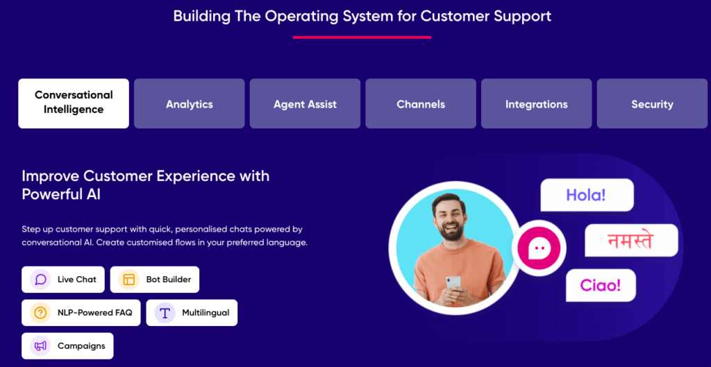
Verloop.io is all about helping companies provide delightful experiences to their customers. We are on the mission to build the operating system of customer support.

The new website copy focuses on the product that’s built on AI, how it can solve customer support related problems. A platform that solves not only for customer experience but also agent experience. We’ve tried to cover how our platform can help with the pains and challenges of different industries.
Suggested Reading: The All-New Chat UI: New Design. New Features.
Minimal Yet Expressive Design
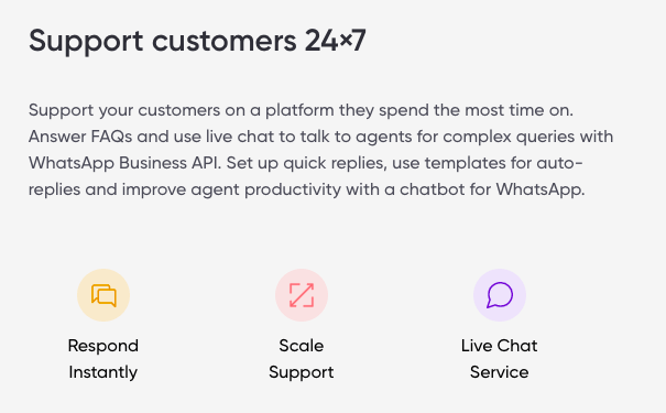
The design is a lot more visual friendly. Our designs are a combination of images and icons, which helps our viewers get a better understanding of the points that we convey in content. The visuals are more human-centric so as to build a familiar connection.
Most of our design elements have round edges which are inspired by our logo simultaneously giving a smooth and modern look to the website. The fonts used on our website and blog are neat and easy to read. The CTA buttons have been used prominently so as to direct the user with ease.

All the colours have been used in a hierarchical structure. A vibrant shade of colours is used for images whereas a subtle tint of similar colours has been used for icons. In addition to this, we have used micro-interactions to make the website look lively and interesting.
Redesign to improve website usability for our visitors
The website has an improved site structure that provides a better user experience. It’s easy to use, navigate and understand.
With the evolving needs of our website visitors, we’ve added brand new sections that allow users to browse through our extensive resources and learn more about best practices.
Mobile devices account for more than 50% of our website traffic. Because of this, we’ve built a website that’s also mobile-friendly. Reading articles and learning about Verloop.io is now accessible even on the go.
We hope you like what you see. Our goal is to constantly delight our users. And for that, we’ll keep enhancing the website even more. So, what do you think of the new look? Let us know in the comments below.


