Modern. Clean. Fresh. New Settings UI Makes Way for Easy Navigation

Modern. Clean. Fresh. New Settings UI Makes Way for Easy Navigation
Just like how conversational AI is more appealing to users because it makes communication with the brands easy and quick, a product is more appealing to its users because of its user interface (UI) and enhanced UX. It makes it easy for users to interact with the product and provide good experiences.
We could go on about the importance of good UI (we’ve done it before, when we did a design overhaul of our website and when the live chat section was updated with new UI) but in this blog, we would like to shed some light on what’s new and why it’s important.
As you know, Verloop.io is building the OS for customer support. That means, it should facilitate an end to end customer support functionality. And the first step starts with setting up the platform to our client’s requirements. And that happens with a slick and easy to navigate `Settings` section.
It’s the one place where you add users to the platform, create categories, add skills, do the integrations, set triggers, set up installation, add plugins, get reports, etc. Basically, this is the powerhouse of the Verloop.io platform like any other product. But we take it quite seriously to deliver a fun experience while working on the Settings. It needs to be easily navigable and easy to use!
And that’s why we continuously work on our design to give it a new, fresh and modern look.
The new Settings UI is aesthetically pleasing and easy to use
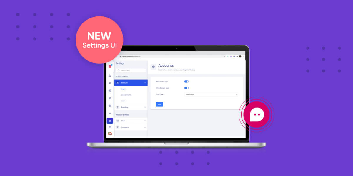
The Settings UI got a design overhaul to match the dashboard and live chat sections. The New Settings UI is a lot more welcoming and accessible. This time, the changes aren’t limited to just what you see. We’ve upgraded the code on the backend as well for superior performance.
The improvements in the new Settings UI can be clubbed under five areas:
- Fresh new look
- Backend upgrade
- Left-hand panel
- Categories
- Search bar
1. Fresh new look
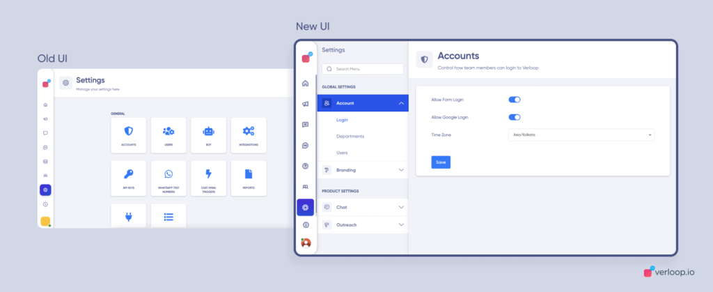
Immediately upon opening your settings section, you will notice our revamped, modern, and fresh new UI. The new design and layout are now in sync with the rest of the platform.
The new look for Settings is not planned to just be pleasing to the eye but to also help you navigate the section easily. By matching the theme with the rest of Verloop.io’s platform, the navigation and browsing experience seems much more coherent and connected than before.

As you can see from the above comparison, the new UI is much more thought-through around the user flow and usability, detailed with more information available at the outset, and easier on the eye. And you can see all the features that are available under each category – making it easy to move around from one option to another.
2. Backend upgrade
A lot has changed since we jumped into the game of Building the OS for Customer Support. Back in 2017, we built everything on MeteorJS but as speed and performance started becoming key differentiators with advanced technology, we have ensured to keep with that pace to provide state-of-the-art technology to our users and their end-users.
To keep up with current times, we’ve moved to ReactJS – a faster alternative that allows you to create reusable UI components.
With this shift in code, your experience in the Settings section will be super fast and seamless. The best part, it makes the transition so smooth, you will not even realise there are many new elements added to the UI. ReactJS FTW!
3. Left-hand side panel
The settings section just got, even more, user friendly with the left-hand side panel.
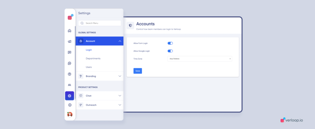
As soon as you enter the Settings section, you will see a left side panel (similar to the Live Chat’s UI). Here you can see different sections and categories, giving you an overview of everything.
The brand new Setting’s look gives a compact view so you can see more features at once. This will take away an extra step of having to go back to the settings page to move from one feature to another. This easy to navigate panel will save you some time toggling between screens.

4. Categories
As you can see in the screenshot, the left side panel on the settings main page is divided into categories. On top, you have the Global Settings (consisting of Account and Branding categories). Below this, you will find Product Settings (comprising the product you’ve subscribed to with Verloop.io, i.e. Chat, Voice, Outreach, etc.)
As Verloop.io is coming up with new products for better customer support, such as Chat AI, Voice AI, WABA, Outreach, etc. this feature will help you access settings for each product in a more efficient way.
The categories in the new Settings UI will make it easier for you to find everything in an instant. Click on a specific product to view its settings right away. You can also type in and search for specific settings.
The reason behind these design changes is to avoid the to and fro between various menu screens – making the entire flow more navigable. You don’t have to open the menu, work and get back to the main menu to access another feature.
5. Search Bar
Search functionality is the key highlight included in this new design update. The advanced search bar is packed into the top of your left-hand side panel of the settings page.
The search functionality allows you to track down elusive features hidden deep within the settings page even with the tiniest of detail. A simple search will list all the features related to your search term. While you are searching, you can see the different feature suggestions (and the paths to get there) listed on the panel. Once you’ve found your feature, you can click on it and you’ll be taken to that page instantly.
While searching, you can see paths to different features
We’ve streamlined the Settings section with the new search functionality to make your life easier – for new and experienced users alike. You can discover features for your product categories conveniently without having to click many buttons.
An upgrade to user experience
One of the things we are most excited about is that the new UI adds value to our users as they can perform actions much faster on the platform. We are bringing a modern approach to using Verloop.io’s conversational AI platform by building advanced features and updating the existing ones.
The new Settings UI update,
- Increases the usability of the product
- Allows easy modification to your product settings
- Makes features easily accessible
- Improves user experience with fast and robust code
We are absolutely pumped about the new design updates and can’t wait to share more updates with our users. At the end of the day, a good support experience starts with a good product. And that’s what we are trying to accomplish here at Verloop.io.
Let us know what you think of the new Settings UI. Leave your comments below.


