The All-New Chat UI: New Design. New Features.
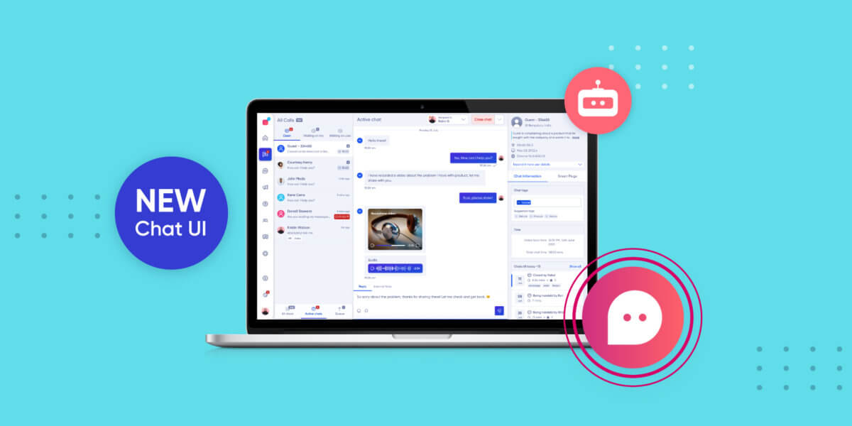
The All-New Chat UI: New Design. New Features.
Conversational AI is playing a more central role in today’s support organisation. Brands are now laser focussed on building delightful support experiences for their customers. To do so, Conversational AI needs to accomplish everything from assisting agents to providing personalisation at scale.
Verloop.io has always existed to become the operating system (OS) for customer support teams. Brands right from banking to e-commerce to healthcare, use Verloop.io to build delightful support experiences.
But it is not easy to build an OS that is easily understood by the users and is at its functional best. We have come to make peace with that fact. However, we always strive to do our best to build a more efficient, faster and more agile OS for customer support in the world.
And design has been at the core of this mission. Verloop.io’s new chat UI is a step in that direction.
We have not only refreshed how the users will experience the Verloop.io platform but also ensured that the new chat UI is aesthetic, functionally more efficient and builds a delightful experience for our customers and their customers.
Redesigned for modern look, productivity, creativity and use
We’ve simplified the user experience with the help of research that we conducted with our customers to empower agent productivity and inspire creativity within your support organisation.
After interviewing many users, we’ve understood their pain points, took in their feedback and realised their expectations. With these considerations in mind, the new chat UI design visualises the product in a new light and the user’s interaction with the product.
It’s modern, fresh, clean and may we say, beautiful.
Verloop.io has always been about helping brands build support at scale and provide delightful support experiences. We aim to delight and satisfy both the agents and customers at the same time. It is not easy but is surely achievable and Verloop.io’s new chat UI is a testament to that commitment.
What has changed in Verloop.io? We have:
- Refreshed Chat List
- Updated Search Bar
- Redesigned Filters v2.0
- Added New Canned Responses Experience
- Reordered Cards on the Information Panel (right hand side)
- Enhanced Past Chats Experience
- Improved Chat Info Section
- Refreshed Timer Experience
- Reimagined Close Chat Experience
Here is how the new design refresh looks like
You can scroll down to read more about each section or jump to your favourite section here
Improved Chat Information Section
Reimagined Closed Chat Experience
Refreshed Chat UI
With the new design refresh, the live chat view is clearly demarcated into 3 intuitive tabs which are available at one glance:
- All chats
- Active chats
- Chats in queue
With the design refresh, you can now access:
- List of all the chats in a single place with the chat status being distinctly visible. For example – closed, waiting for agent to respond and open, new, etc.
- Also, the simple search, coupled with our revamped filters option, is available right away to be applied on your All chats list. Search is of no use if it is not easily discoverable and if it doesn’t bring you the desired results. Hence, the new search bar is right at the top-centre of the left panel and allows you to apply filters to reach the desired result faster.
Moreover, Active chats now has no filter and it fundamentally shows chats that are assigned to the user who is looking at the live chat. It has 3 statuses, which make it super easy for your agents and admin:
- Open
- Waiting on me
- Waiting on user
And going forward, we will now showcase a visible separate tab at the bottom of the chat list panel. It doesn’t have any statuses but gives you the option to see all chats, active chats and chats in the queue.
In case you are wondering how a manager/admin can access the chats which are assigned to their team, the All chats tab coupled with our new filter option mentioned above will get the list for you. For that matter, an admin and manager (basis user access control) can access all chats. However, agents have a restrictive view of chats that are assigned to them alone.
While talking to our users, one point stood out.
They continuously gave us feedback for enriching the user information for adding more context for agents to pick a conversation with a customer. So we went ahead and updated the Active chat list with more useful information. These inclusions include:
- User name
- Handler name
- Last message content in the room
- Chat status (whether closed or not)
- Count of unread messages from the user along with a new unread message icon which stays till the agent sends his next message.
- Department name
- Timer
- Number of search results
With this information, agents will have all data in one glance and can now resolve queries faster and more efficiently.
Previously, it was tough for admins and agents to take any action on a chat – assigning a chat, updating the status. But with the new design, these steps have become faster and easier to take.
Suggested Reading: Modern. Clean. Fresh. New Settings UI Makes Way for Easy Navigation
Search Bar
You will have an always-available search bar in the All chats tab going forward. Now you can Search by Agent as well as Department. And yes, we show the count of search results as well. Welcome to the Support Automation that works (and not just fresh). 🙂
Filters v2.0
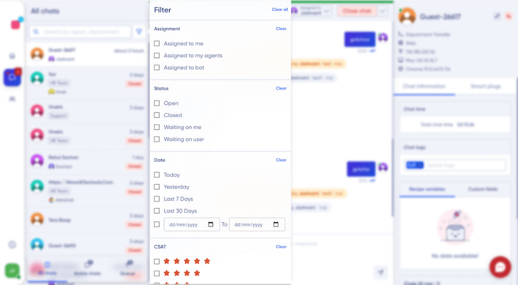
Filters are now upfront and available in the all chats section. As a user/admin, you can now filter by
- Assignment
a. To bot
b. To agents
c. To myself - Status of chats
a. Open
b. Closed
c. Waiting on me
d. Waiting on user - Date
- CSAT
- Tags
- Visitor email
- Visitor phone number
With ‘Search by agent and department’ already available in the new search bar, when required filters and search can be used in intersections.
The all-new filters will save you valuable time in finding the right chat and taking action on it.
Canned Responses
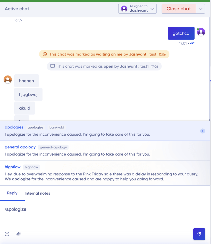
Canned responses are one of the most useful features while chatting with a user. To ensure agents can find the right response on time, we’ve arranged and bucketed all your canned responses based on tags.
When you open the canned response view, you will see a list of tags to select from. Here, you can ‘search’ for the right message with keywords present in tags, commands, or even inside the text message bodies.
By expanding the search categories, agents will be able to save time when they search for the canned response and respond quickly to the user. Moreover, with the new design refresh, you can easily navigate through the keyboard too.
Cards Re-order
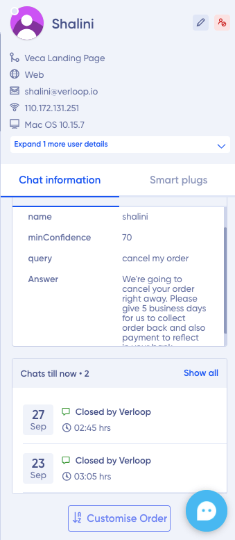
With the new Cards design, your agents/managers can customise the order of cards in the information panel on the right-hand side.
You and your team can now rearrange the cards as per your requirements and give them the unique flavour of your brand.
(Design Win: We have created a 2 tab widget here saving space and scrolling!)
Improved past chat experience
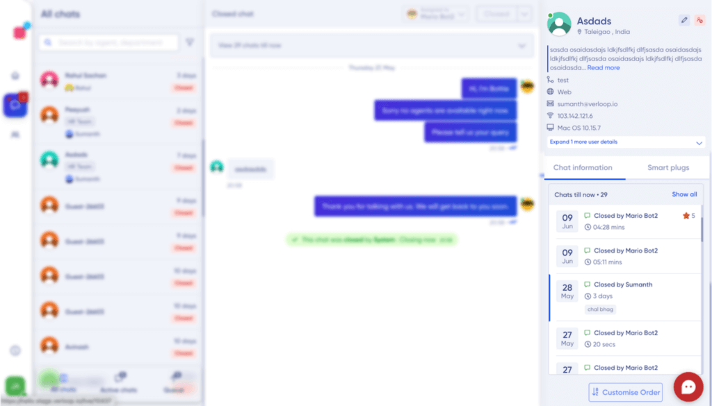
With the new refreshed design there are 2 ways to access the Past Chat experiences:
- Access through the redesigned past chat widget in the information panel
- Scroll to the top of the conversation window and click on the “View past chats till now” option
This is super useful because an agent can never go wrong with the chronology of the interaction with the customer and can pick up the context and pace it up really fast.
The past chat widget experience now shows more relevant data at a single glance
- Date the chat was initiated
- Resolution time
- Closed by
- Tags attached
- Number of chats the user had till today
- CSAT score
- Local chat time
The ‘Show All’ option will open a floating window over your conversation panel which will show the complete past conversation separated by horizontal tabs. This window can be closed easily to get back to your current chat.
If you would like to access all the room related information of any past chats for an individual contact – you now just simply need to click on the specific chat in the information panel widget, your current conversation view will be updated accordingly.
Improved chat information section
With the design refresh, we have given Visitor Information a standard space as a widget and we provide an ‘expand’ option on click to view more information.
Also now the widgets are separated into 2 tabs
- Chat information
- Smart plugs
With this rich customer profile, agents can gather information on users in the shortest possible time and engage with them with an added personalisation.
For example, they can quickly see the tags or previous chats and pick up conversations from there.
(Design Win: We created a 2 tab widget here saving space and scrolling for your agents and managers!)
Refreshed timer experience
The Chat Timer is now moved to the RHS information panel as a widget called- Chat time/Total chat time.
We brought in functionalities that made more sense than just being there for no good reason:
For example, the total time of the chat was not a useful metric for an agent but time lapsed between a customer ping and an agent replying to the customer was supercritical.
From the feedback we received, we now give all our brands two types of timers (however only one will be shown at any point in time).
- Visitor Timer starts at the end user’s most recently sent message and stops when the agent types a reply.
- Once the agent sends a message the previous timer disappears and we switch to other Timer which reports time seconds ago, a few minutes ago etc.
During a live chat session, this widget will give agents a view of the time elapsed between messages. Once the chat is closed, this widget will give agents the total chat time.
Talking about the timer experience, we made one more change with respect to time. Since our product is used by customers across the globe, we ensured that an agent (who could be handling chat from anywhere in the world) could see the local time of the customer. This ensures your end-users experience improves multifold.
Reimagined closed chat experience
Closing the chat is also an experience that we have modified to build in for a better agent experience.
Initially, the option for closing a chat used to be in a dropdown. Now to make it super easy for your agent, you will have the following options:
- For an open chat, you will see the Close button in RED and it will be available at one button click, which will allow you to click and opt to close.
- For a ‘waiting on me’/user chat, the agents will have to choose from the dropdown.
Adding tags and remarks used to be a 3-step experience. With the design refresh, the new experience is optimised for a seamless 2 step process.
Once the user opts to close a chat:
- A single pop up with two sections appear:
- TAGS (Required/optional):- Already attributed tags are auto-populated here. In addition, we also suggest some frequently used tags.
- Remarks (Required/optional):- User can simply type in remarks or choose from a list of saved remarks.
- All the necessary checks and error messages will be mentioned on this page itself.
- Agents will now have the option to go ahead and close the chat following set conditions or cancel and go back to handling this chat.
Aesthetic changes
The new design refresh gives a new look to the platform. It’s aesthetically pleasing and ensures ease of use. For example, we’ve associated few colours with specific features for easier action.
- Grey coloured notifications in a neutral instance
- Red coloured notifications in case of a red flag or alert
- Orange/Yellow coloured notifications in case the user action can be taken but is not Verloop.io recommended
- User can take an action but we do not recommend. For example, deleting your team mate who holds the agent status and is online.
- Option to force logout an agent. An admin can do that but we do not recommend this action and require you to reconsider.
- Blue is used when you have saved any information on the platform
Aligning with your north star metric
We asked ourselves and the customers – what is the most important metric for you? After talking to the users, we’ve come to the conclusion that time is of the essence.
Responding quickly and resolving queries as soon as possible are two of the top priorities in customer support. Hence, the following two metrics can be considered the north star metric for your customer support team:
- Average response time
- Average time to resolve a ticket/query
So we ensured that all allied metrics that contributed to these north star metrics were available right there at the centre of the bot platform. So that none of us lose that direction.
We ensured that design and analytics marry each other at an early stage and are not retrospective actions or processes.
Hence, innovation and usability have been at the forefront of the new design refresh journey. The idea is to reduce complexity in the user workflow and make features easily discoverable.
It’s aimed for higher agent performance that would translate to higher efficiency, faster ticket resolution and thus cost benefits.
For example, agents can save 3-5 seconds by just closing the chat. This amounts to >100 hours saved in a month per agent (3 seconds x 100 chats a day x 21 working days in a month). This can be extrapolated to many other interactions on the user interface that saves a lot of time for your agents cumulatively.
Verloop.io is more than just a Conversational AI platform. We aim to be the operating system for customer support. It’s where brands will build delightful support experiences for their users. And it begins with our users.
We are just getting started. This is just the beginning.
We hope you are as pumped for this release as we are. We absolutely cannot wait for brands to reimagine their support.
Leave your comments below and let us know what you think of the new design refresh.


